Understanding how color palettes can reflect our weekly experiences is an intriguing journey that delves into both psychology and personal expression. Color has the power to influence our emotions, behaviors, and perceptions, creating an intimate tie between our external world and our internal states. As we move through our weeks, the colors we choose—whether in clothing, home decor, or artistic ventures—can mirror our moods, energy levels, and overarching themes in our lives.
When we think about color theory, it’s essential to recognize that every hue has particular connotations. For instance, blue is often associated with calmness and clarity, while red can evoke passion and excitement. Green, the color of nature, brings a sense of balance and tranquility, while yellow symbolizes optimism and cheerfulness. These associations can shift subtly based on individual experiences and cultural contexts. Therefore, when we select colors throughout our week, we may unknowingly align our choices with our emotional landscape.
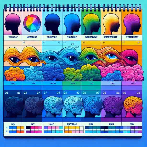
At the beginning of the week, many individuals feel a surge of motivation and enthusiasm, often represented by vibrant colors. These colors can include bold yellows or energetic oranges that symbolize the potential of new beginnings. As one embarks on the tasks of the week, it’s common to adopt colors that reflect optimism and readiness. For many, these choices can bolster productivity and set a positive tone. However, how often do we stop to consider why we are drawn to specific colors during this optimistic phase?
Midweek often brings a blend of emotions. The initial excitement may give way to feelings of overwhelm or fatigue, especially if work demands heighten and personal challenges emerge. During this phase, the colors we gravitate toward may shift. You might notice a turn towards cooler tones like greys or blues, which reflect a desire for peace and respite from the cacophony of daily responsibilities. Observing this shift can help individuals understand their emotional state more profoundly—showing that attuning to color preferences is also an exercise in self-awareness.
As weeks progress into their latter days, the emotional landscape may undergo yet another transformation. For some, Fridays spark a return to brighter, more vibrant hues, as the weekend’s possibilities take center stage. Others, however, may find themselves leaning into earthier, more subdued tones like browns and dark greens, signaling a need for grounding after a hectic week. Recognizing this pattern can be a powerful tool for self-reflection. Reflecting on how these shifts in color choices correlate with life events and personal feelings allows for deeper insight into one’s emotional rhythm.
In addition, even the spaces we inhabit—the colors on our walls, the art we choose to display, or the clothes we wear—serve as extensive canvases that echo our inner lives. A home painted in soft, pastel tones may indicate a serene lifestyle, while a bold, eclectic decor can suggest vibrancy and chaos. Individuals often curate their environments to match their psychological states, perhaps subconsciously aiming to create harmony or energize themselves.
Through our digital interactions, the colors we use in our online presence—from social media posts to website designs—also communicate our emotional realities. The color palette of an Instagram feed, for example, can reflect one’s mood across weeks and months, portraying not only artistic preferences but also emotional states. Do you prefer soft pinks and blues, creating a feeling of tranquility? Or maybe you lean towards vivid scale color schemes that energize and engage? This exploration extends our understanding of color beyond mere aesthetics and into the terrain of emotional health.
Moreover, cultural factors should not be overlooked. Different cultures imbue colors with various meanings and emotional weights, allowing for a rich tapestry of implications. In some cultures, red symbolizes luck and prosperity, while in others, it may indicate warning or danger. Thus, how individuals resonate with colors throughout a week might also intersect with their cultural backgrounds, personal history, and community.
Conscious engagement with color—acknowledging its emotional resonance—can enhance our week-to-week experiences. When we begin to track our color preferences, we cultivate a habit of mindfulness that can fuel emotional intelligence and self-awareness. Moreover, this practice can become a resource for navigating challenging periods. If midweek blues compel individuals to embrace soothing blues, they can consciously make choices that bolster their spirits, such as incorporating energizing yellows or greens into their outfits or environments.
By reflecting on color palettes and their connection to our weekly experiences, we can foster a continuous dialogue with ourselves—one that enriches our understanding of our emotions and their complexities. Such insights can guide decisions about how to spend our time, where to find joy, and how to cultivate spaces that nurture our well-being.
Ultimately, the realization that color palettes reflect our weeks is more than a mere observation; it’s an invitation to explore a deeper connection with our emotions and our surroundings. It encourages us to be aware of how visual stimuli influence our mental landscape. The experience can be transformative, prompting us to curate our choices intentionally—not just to beautify our lives, but to create environments that resonate with our authentic selves.
As you progress through your week, take a moment to notice how colors appear in your life. Reflect on those emotional transitions and consider how you can harness the power of color to affirm and enhance your experiences. After all, understanding the intersection of color and emotion can lead to profound insights, helping us lead more fulfilled and self-aware lives. Embrace the journey of color, and let it guide you toward a deeper understanding of yourself and your emotional cadence.