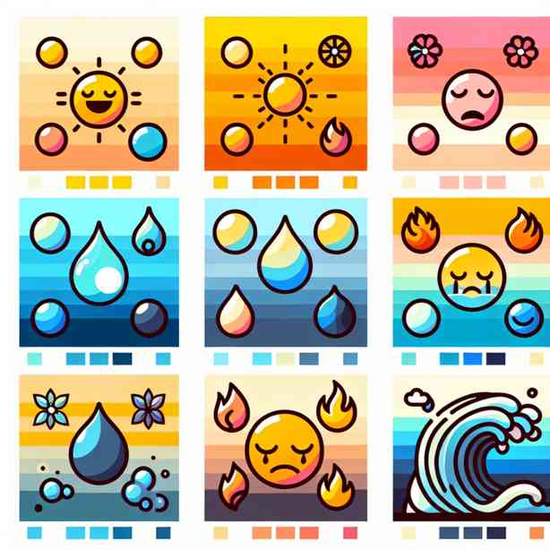
Color is a powerful tool that can express a myriad of emotions, convey messages, and create atmospheres. The relationship between colors and moods has intrigued artists, designers, and psychologists for centuries. Each hue, shade, and saturation carries innate meanings that resonate with human experiences and perceptions. In this exploration, we will delve into how color palettes reflect moods, impacting everything from branding to interior design and personal expression.
The psychology of color suggests that color choices can influence emotions and behaviors. This phenomenon is well-documented; for instance, red is often associated with passion, energy, and urgency. It can provoke feelings of excitement or even aggression. Conversely, blue tends to evoke a sense of calmness and stability, often linked to serenity and trust. This dichotomy illustrates how color can embody contrasting moods, affecting our perception of our surroundings and even our interactions with others.
In graphic design and branding, the deliberate use of colors is crucial. Brands often select specific color palettes to evoke desired emotions and associations with their products or services. For example, fast-food chains like McDonald’s utilize red and yellow in their branding. The warm tones stimulate appetite and foster feelings of happiness and cheerfulness, which can encourage customers to dine in. On the other hand, luxury brands such as Chanel or Gucci often employ black or deep, rich tones to convey sophistication, elegance, and exclusivity.
Interior design is another arena where color palettes significantly shape mood. The choice of colors in a living space can create comfort, vibrancy, or tranquility. Warm colors like oranges and yellows can create an inviting atmosphere, perfect for socializing, while cool colors like green and blue can provide a serene environment conducive to relaxation. Neutrals, such as grays and beiges, can offer a timeless quality, serving as a background that allows other elements of design to shine.
Moreover, seasonal color palettes reflect the moods associated with different times of the year. Spring is characterized by pastel shades that evoke feelings of renewal and optimism, while autumn often features earthy tones that bring about a sense of warmth and nostalgia. These seasonal shifts in color not only influence fashion and home décor but also impact collective moods and behaviors within society.
Personal expression through color is yet another dimension to consider. Individuals often choose colors in their clothing, accessories, and home decor that resonate with their emotional state. For example, someone feeling adventurous might wear vibrant, bold colors, while someone seeking comfort may gravitate towards softer, muted tones. This choice serves as a visual language, allowing people to communicate their feelings non-verbally. Furthermore, many people find solace in using color in creative outlets such as painting or crafting, where they can channel their emotions into tangible forms.
Cultural interpretations of color also play a significant role in how moods are reflected through color palettes. Different cultures attach unique meanings to colors, which can influence design decisions in diverse ways. For instance, in Western cultures, white is often associated with purity and new beginnings, particularly in weddings. In contrast, in some Eastern cultures, white is associated with mourning. Understanding these cultural nuances is essential for anyone looking to utilize color effectively in a global context.
In digital media, color palettes hold tremendous power in shaping user experience and engagement. Web designers strategically select colors to elicit specific reactions from users. A website with a vibrant, colorful palette may evoke excitement and enthusiasm, thereby attracting users and encouraging interaction. In contrast, a site featuring a minimalist color scheme with muted tones may foster feelings of professionalism and sophistication. The key is to align the color palette with the overall message and purpose of the digital content.
Education also benefits from an understanding of color psychology. Classrooms decorated with bright, stimulating colors can enhance learning and creativity among students. Conversely, colors that are too intense can lead to fatigue and distraction. Thus, educators and administrators must consider how to use color effectively to create environments conducive to learning.
In advertising, colors play a pivotal role in consumer behavior. Various studies have shown that color can grab attention, influence perceptions, and even affect purchase decisions. A well-chosen color can make an advertisement more effective by evoking the right emotional response in the target audience. For example, studies suggest that using blue can inspire trust, making it a popular choice for financial institutions, while green evokes feelings of peace and health, often used by organic and eco-friendly brands.
As technology continues to evolve, the tools available for creating and experimenting with color palettes have expanded significantly. Online platforms and applications allow users to generate color combinations, explore trending palettes, and draw inspiration from various sources. These resources democratize the design process, enabling individuals without formal training to express themselves through color in innovative ways.
In the realm of therapy and wellbeing, color is increasingly recognized for its healing properties. Color therapy or chromotherapy leverages colors to promote emotional and mental healing. Different colors are believed to resonate with specific energy frequencies, fostering relaxation, uplifting moods, or even stimulating creativity. People may choose to incorporate certain colors into their environments or daily routines to enhance their emotional states intentionally.
Navigating the complex interplay between color and mood can provide critical insights into human behavior and creativity. Whether it is in design, personal expression, or cultural contexts, color holds the power to influence and reflect our feelings and experiences. As we continue to explore and embrace the depths of color psychology, we gain a deeper understanding of how palettes can serve as powerful conduits of emotional expression, connecting individuals to their environments and to each other.
In conclusion, the study of how color palettes reflect moods illuminates a fascinating intersection of psychology, art, and cultural expression. By recognizing and harnessing the emotional resonance of colors, we can enhance our environments, foster better communication, and celebrate the vast spectrum of human emotions. Whether you are a designer, an artist, or simply someone looking to brighten your space or wardrobe, an awareness of color psychology can greatly enrich your experiences and connections in everyday life. Understanding the language of color empowers us to create and curate experiences that uplift, inspire, and resonate deeply with ourselves and the world around us.